Caitlin Maloney
contributor to 1 poster

Artist
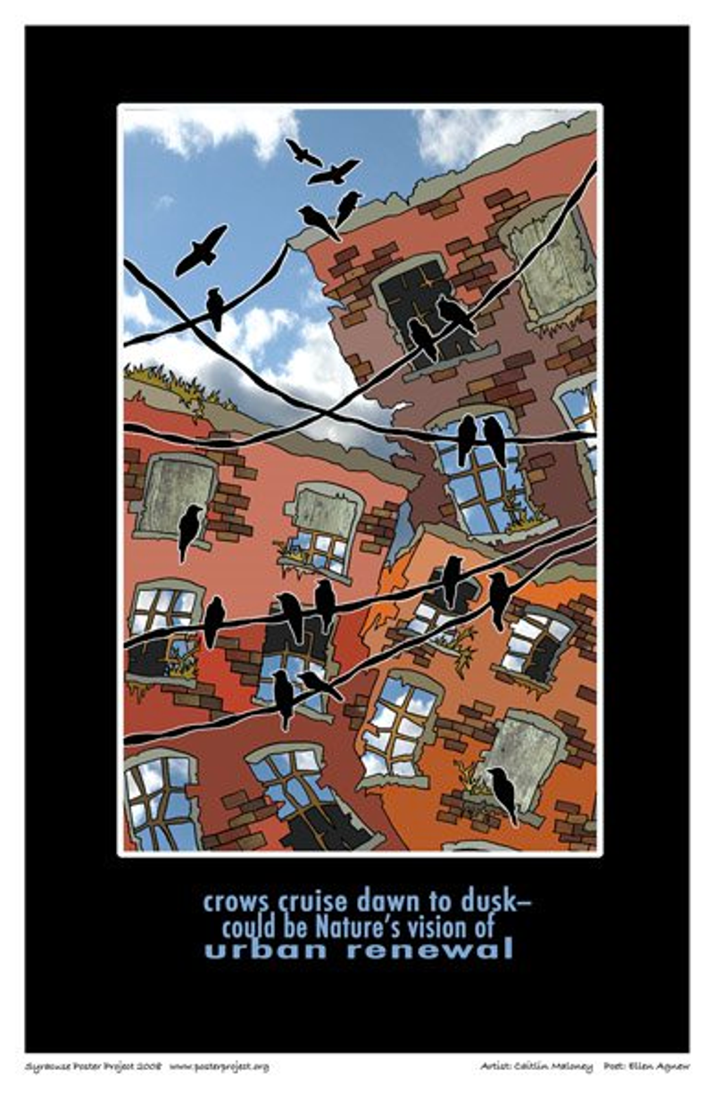
Well, a lot of buildings in Syracuse obviously aren't in the best shape, but they are still aesthetically pleasing. I think the old, run-down ones are much more interesting than the newer ones. The "urban renewal" idea in this haiku fits well with that.
I took this opportunity to go to my favorite alley downtown to get inspired. From that I noticed the color variation in the building, the overgrowth of plants, and as I stood looking up at them, I thought tilting the buildings could add some flair.
When choosing a haiku to illustrate, the crow imagery jumped out at me. I had already wanted to use the silhouette of the crows and wire because it's something I am constantly seeing; not just in Syracuse. But when I lived on South Campus, at around four o'clock every afternoon, the crows would be all over. They would stay until dusk, then fly off somewhere. It was nice for me to be able to use that element in my design.