Chad Wallace
contributor to 1 poster

Artist
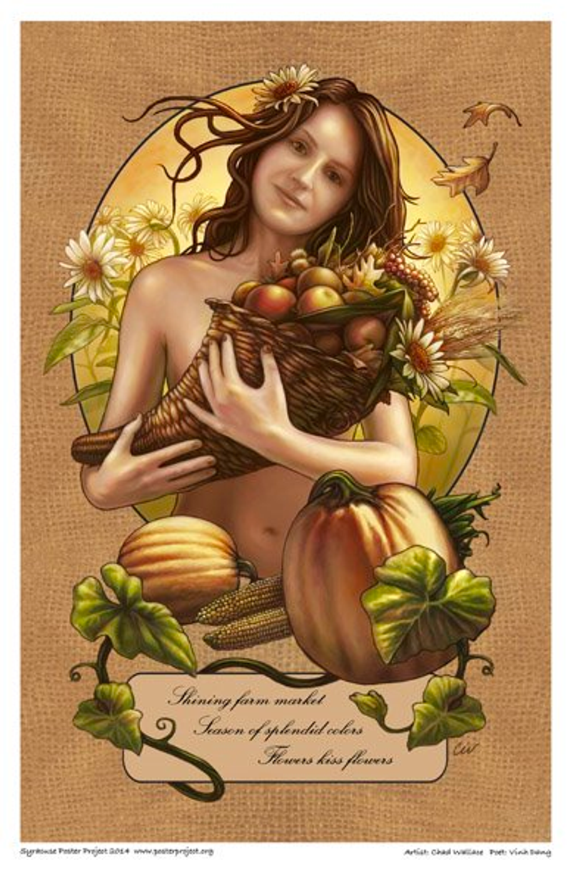
I typically draw a lot of nature scenes, so this poem appealed to me right away. It was autumn at the time, and I was inspired by the fall colors and farm markets that are prevalent in my area. Often when I sit down to create art I have a clear plan and make multiple sketches before diving into the finish. This time I allowed instinct to take over. All I know is that I wanted to my rendering in an art nouveau style like the great Alphense Mucha. He was able to combine naturalistic elements with graphic designs to create a total image. I wanted my solution to the poem to have the same impact. I started off with the woman holding the cornucopia and space for the type. Because I was working digitally, I could adjust scale, experiment with different ideas, and create a strong composition. I was careful not to interpret the poem too literally and chose to leave much ti the imagination.