Jackie Evangelisti
contributor to 1 poster

Artist
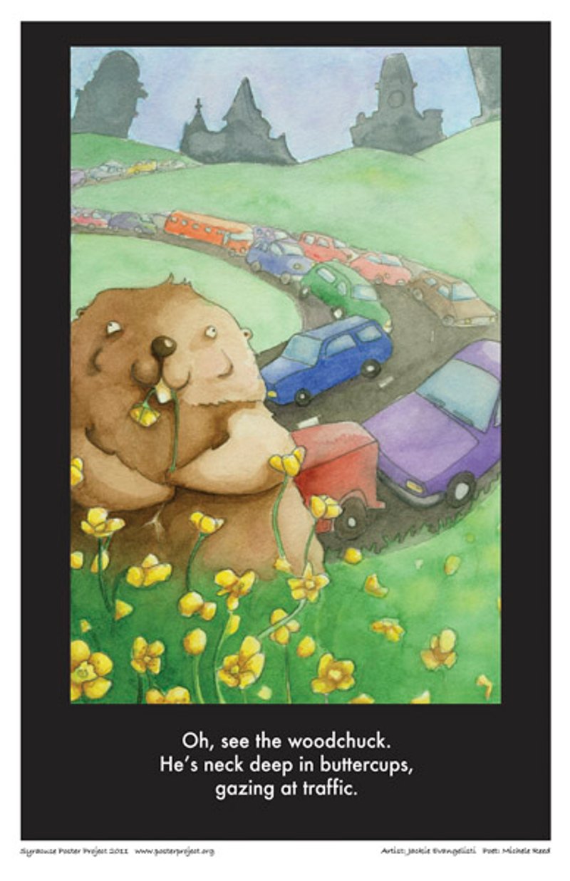
For my poster art, I chose the woodchuck haiku because it was the zaniest — it gave me a chance to work with something “cute.” I want to illustrate children's books, so this was a great chance to add child-like qualities to the energy and intellect of the haiku. It was easy to create the visual imagery. I just had to visualize the scene behind the haiku — it turned out to be Syracuse.
With any assignment or piece for myself, I try to solve the problem in the simplest yet most professional looking way. Ink and watercolor work best for me at the moment, enabling me to give my characters puzzling expressions that make the viewer wonder what's going on in their brains. I think the key really is in the eyes.