Olivia Ferlenda
contributor to 1 poster

Artist
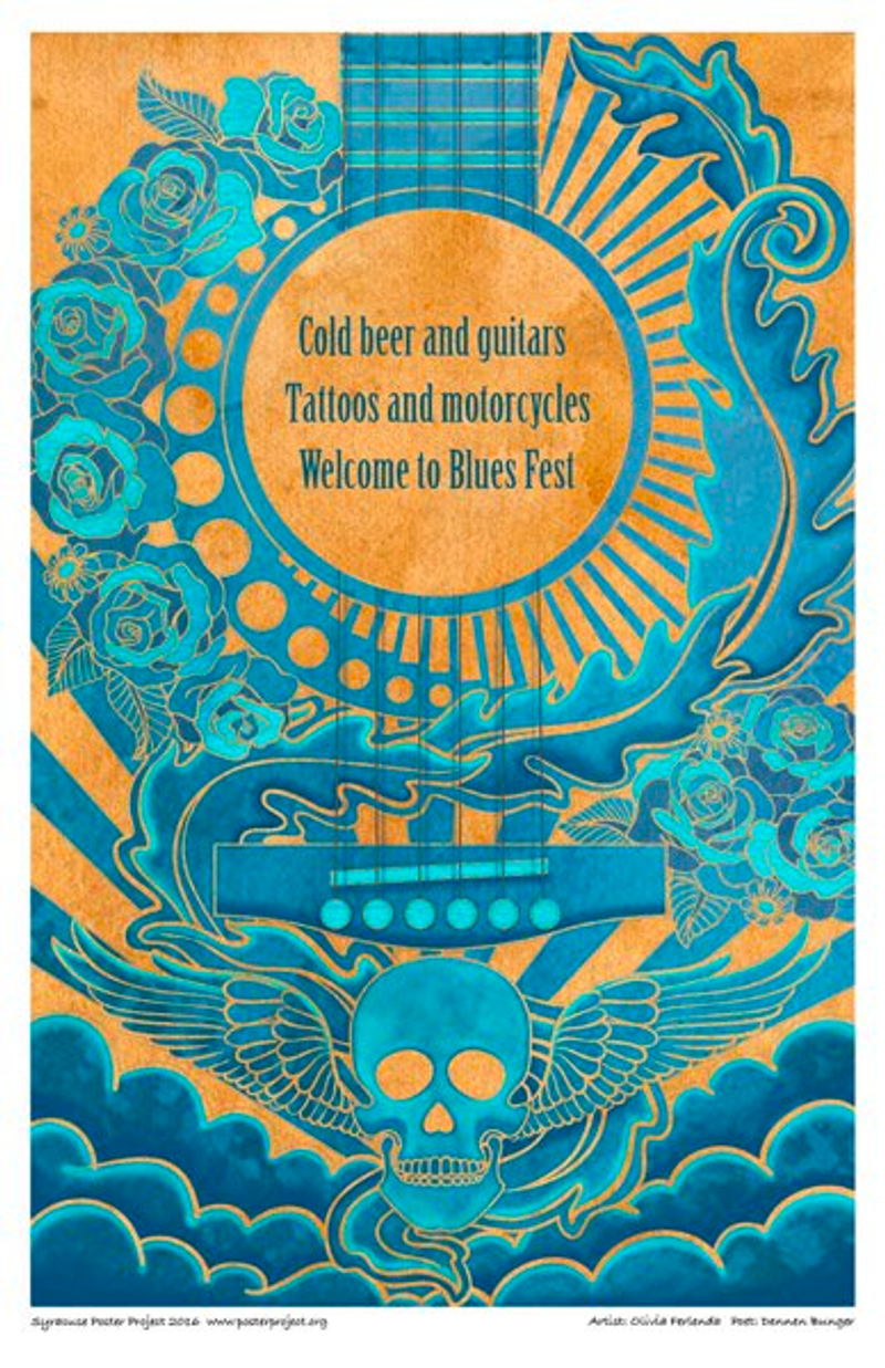
I like to play with shapes and color and texture, and that's what I tried to incorporate in my poster. First, I started by drawing a sketch. Once my sketch was finalized I scanned it into the computer so that I could do the line work digitally. After that I applied hand done water color textures to give it a rustic feeling. My favorite part of my poster is the area around the sound drum of the guitar where I played with repeating lines, circles, and roses to create a graphic pattern. I'm specifically happy with this area of my poster because I believe that the different elements that I used work well together and create a nice flow throughout the piece. In addition to that I also added a skull with wings to add some rough elements that would contrast the “pretty” floral imagery to create the relationship of soft vs. hard.