Tom Kovach
contributor to 1 poster

Artist
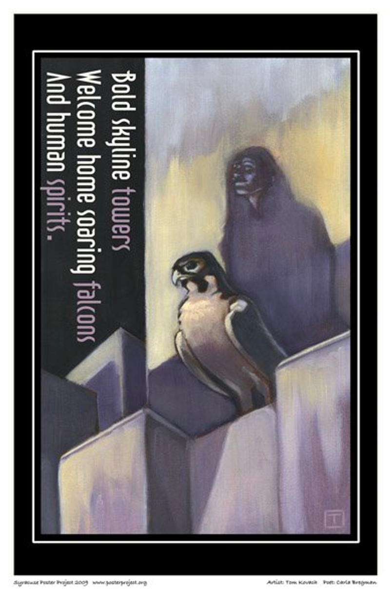
What I liked about this haiku was its ambiguity. While haikus are inherently simple, they are also elegant, spiritual, and visual, which is very helpful when you're doing an illustration.
Since the haiku is subtle, I wanted to go in a shape-oriented direction: not a lot of detail, just rectangles, squares and big, broad shapes.
I think my favorite part of the piece was the way I incorporated the text vertically. I thought it would be interesting to turn the haiku on its side to really get the viewer involved with the work.