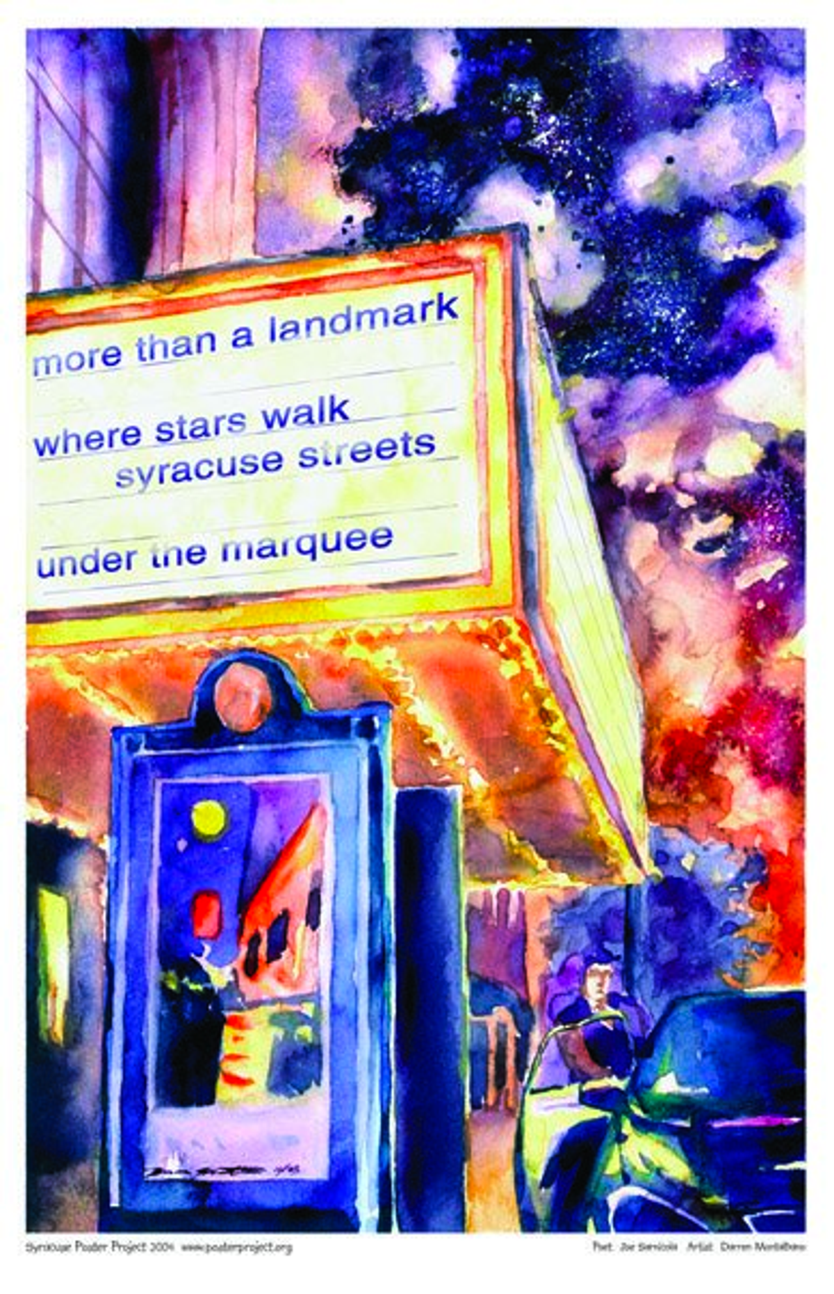
Poster Image

Item#: 2004SYR13
Purchase Details
11x17-inches, printed on heavy weight (100-pound) Hammermill cover paper. We package each print with a piece of chipboard in a clear plastic sleeve.
You also receive…
An information page with photos of the artist and poet, and hand-written comments from each.
A framing coupon, good for a 20 percent discount at Edgewood Gallery, a custom frame shop at 216 Tecumseh Rd., Syracuse.
Medium- and large-format posters are available by custom order. Contact us for details.
Poem Inspiration Location
More than a Landmark
poster information
Description
More than a landmark
Where stars walk Syracuse streets
Under the marquee
I find haiku one of the most challenging forms of poetry. It looks simple and easy until you try to do it. I've read books by the old masters and the modern writers, and I never ceased to be impressed by the craft that goes into a good haiku.
The seasons are an important aspect of it—the weather, sky, nature. And I've always interpreted the form to have two images that don't appear to be related, but in the context of the poem, they reveal something about each other. That's what I was implying with the line, More than a landmark—that there's more to the Landmark than what you look at. It's something you experience.
The first time I went to the Landmark, I was really impressed. Today's theaters just can't compare to this.
When I read this poem, the line about stars jumped out at me. I know it's supposed to be about stars on the sidewalk. But I immediately thought I could parallel that with stars in the sky. I just imagined a nice night scene with the theater all lit up and stars in the sky.
I originally painted the theater from a different angle, and it was similar to that VanGogh piece, the cafe at night. I just feel there's a really strong mood in pieces like that, where the night is dark, but there's light from the street, a cafe, or in this case, the theater.
A lot of the illustrators in class shoot their reference shots, then illustrate the scene exactly like the reference. They would probably shoot the theater at night. I just went out during the day. I had the reference of what the theater looked like, but then I went in with my own ideas, of what I wanted the color and brightness and contrast and value to look like.

